The team behind the iconic 2008 parkour game Mirror’s Edge has revealed a surprising truth about the game’s instantly recognizable look: it wasn’t the original plan, and it wasn’t created purely for style. In a recent conversation with Design Room, the developers explained that Mirror’s Edge initially looked nothing like the clean, bright city players remember.
Early versions of Mirror’s Edge were built to resemble the gritty, brown-toned dystopian cities that dominated many Unreal Engine titles of that era. Think heavier textures, more visual noise, and a more traditional “realistic” atmosphere. According to the developers, the idea wasn’t bad at all visually—it actually looked good—but it lacked a distinct identity and blended in with the crowd.
Then the biggest issue appeared the moment the game’s core mechanic kicked in: speed.
Mirror’s Edge is all about rapid movement—sprinting, leaping, wall-running, and flowing across rooftops without stopping. During early testing, that fast-paced parkour through highly detailed environments triggered intense motion sickness. The developers compared the sensation to the nausea some players feel when experiencing similar movement in virtual reality. The problem came down to a disconnect between what players were seeing on screen and what their bodies expected to feel, and the faster testers moved, the worse it got.
Senior producer Owen O’Brien said the team realized quickly that the original visual direction was making people nauseous far too often. The solution wasn’t to slow the game down—speed and flow were the heart of Mirror’s Edge. Instead, the team made a bold decision: simplify the world.
They found that motion sickness became less severe when the environment was cleaner and less detailed. That discovery pushed the developers toward a new artistic direction—one that would eventually become Mirror’s Edge’s defining trait. O’Brien even admitted the early build looked like a typical Unreal game at the time, which made the decision to change course even more important. He wanted the game to be instantly recognizable at a glance, the kind of screenshot you’d see in a magazine and immediately know which game it was.
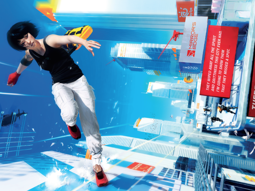
Art director Johannes Söderqvist also described the prototype as “pretty brown” and fairly generic, not because it was low quality, but because it didn’t have a strong style of its own. With the motion sickness problem and a desire to stand out on seventh-generation consoles, the team experimented by stripping back color and reducing texture complexity. That’s how Mirror’s Edge landed on its signature look: wide, bright spaces with a sterile white atmosphere, punctuated by bold pops of color—especially red highlights that naturally guide players toward ledges, doors, poles, and routes forward.
In other words, Mirror’s Edge’s most famous visual choices weren’t just an artistic flourish. They were a practical fix that also happened to create one of the most memorable aesthetics in gaming.
Mirror’s Edge launched on PlayStation 3 and Xbox 360 in 2008 and went on to sell over 2.5 million copies. It earned praise for innovative first-person parkour gameplay and striking world design, even as some critics pointed to a weaker story.
The series returned with Mirror’s Edge Catalyst in 2016, shifting toward an open-world structure. While the reboot expanded the setting, it was often seen as offering limited variety in activities, and some players reported story repetition that hurt its momentum. Still, the Mirror’s Edge style of movement and rooftop traversal left a lasting mark, influencing later parkour-focused games such as Dying Light.
Looking back, it’s fascinating to learn that Mirror’s Edge became a visual icon not only because the team wanted a unique art style, but because they needed one—an approach that made high-speed movement feel better to play, while giving the game a clean, bold identity that still stands out today.


