If you glanced at a phone running Vivo’s OriginOS 6 from across the room, you might mistake it for iOS 26. The new Android skin leans hard into the Liquid Glass look that Apple recently popularized: rounded app icons, frosted glass overlays, a glass-like floating dock, and wallpapers that shift with depth and light. It’s a striking aesthetic that has drawn both admiration and criticism on the Apple side for prioritizing beauty over usability in some areas—now it’s landing on Vivo devices with a familiar flourish.
Vivo’s pitch centers on “flow” and “effortless motion,” emphasizing animation fluidity and cohesion over a ground-up makeover. Still, the resemblance spans much of the interface, with the Lock Screen looking especially close to Apple’s latest approach. Whether you call it cross-pollination or copycatting, it’s clear iOS 26’s design language is shaping the broader smartphone scene again.
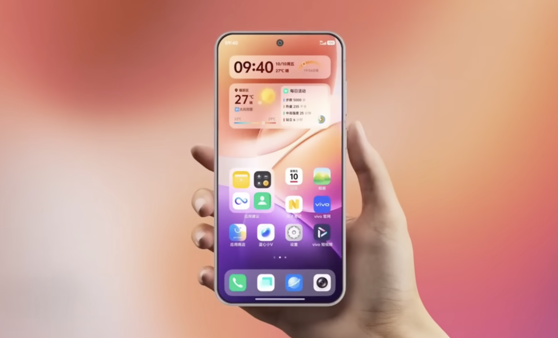
Here are the most noticeable overlaps between OriginOS 6 and iOS 26:
– Translucent panels and frosted blur across notifications, widgets, and system menus
– Rounded app icons and soft-cornered buttons that echo Apple’s current iconography
– A floating dock and layered UI depth that create a subtle, glass-like shadow effect
– Dynamic, refraction-style wallpapers that react to motion and lighting for visual fluidity
– A unified quick settings layout with familiar spacing, gradients, and translucent elements reminiscent of Control Center
– A Lock Screen look and customization flow that land very close to Apple’s latest
Is this inspiration or imitation? In smartphones, borrowing and refining ideas is nothing new—design trends often converge as brands chase clarity, polish, and perceived premium quality. But the degree of overlap here raises fair questions about originality. Strategically, Vivo could benefit: an iOS-like sheen may boost the perceived quality of its phones out of the box. The risk is that users and reviewers see a beautiful facade without meaningful innovation beneath it.
What will matter most to everyday users is execution. If OriginOS 6 pairs its glossy visuals with smooth performance, battery-friendly animations, legible typography, and strong accessibility, the look will feel justified. If the frosted layers hinder clarity or add friction, the shine may wear off quickly. Consistency across third-party apps, robust customization, and sensible Lock Screen tools will also determine whether the design elevates the Android experience or just echoes someone else’s playbook.
Bottom line: OriginOS 6 signals how influential iOS 26’s Liquid Glass aesthetic has become. Whether it marks a broader shift in Android design or just a high-profile nod to Apple, Vivo has placed a clear bet on slick translucency and depth. The question now is whether it delivers the same sense of premium polish without compromising everyday usability. Would a familiar iOS-style interface make you more likely to try a Vivo phone, or do you want bolder ideas that move the look and feel forward?