Your iPhone’s alarm feels like it uses an endlessly spinning wheel for picking hours and minutes, but that smooth scroll is actually a clever illusion. What looks like a circular dial is just a very long, finite list dressed up to feel infinite—proof that smart design can shape how we perceive an interface.
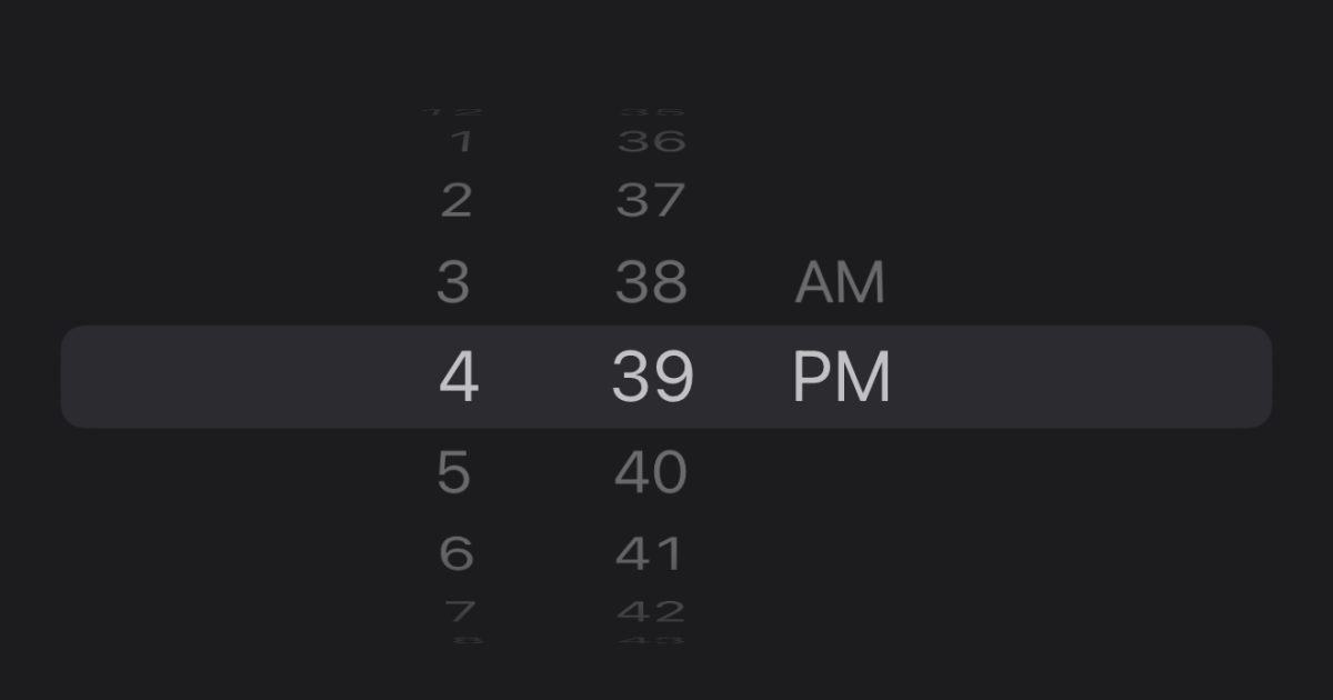
Open the Clock app, go to Alarm, and flick the hour or minute picker as fast as you can. If you keep going, you’ll eventually hit the end of the list. Users on social platforms have shown that the scroll appears to cap out around 4:39, or 16:39 in 24-hour format. That little hiccup gives the trick away: this isn’t a wheel looping back on itself. It’s a list with repeating sequences of values, framed to feel like it never stops.
How it works is simple and elegant. Instead of building a true circular picker, Apple stacks repeated blocks of hour and minute values in a long list. The middle of that list is what you typically see, and the interface centers your selection in a “window,” masking the repeats and making the motion feel like a continuous loop. Because there’s a top and bottom to any list, sprinting through it fast enough eventually brings you to the boundary.
People have even turned this into a mini-challenge. Some users report timing how long it takes to hit the end—one person claimed 6.4 seconds, another confirmed the 16:39 stop in 24-hour mode. Try it yourself: launch Clock, tap Alarm, edit an alarm, and spin the hour or minute column as fast as you can. If you reach the limit, the illusion snaps and you’ll see the truth behind the magic.
Why design it this way? A faux wheel has big advantages:
– It feels familiar and tactile, like a mechanical dial, which makes setting times intuitive.
– It avoids the complexity and performance overhead of maintaining a true circular data structure.
– It enables consistent animations and precise selection without the pitfalls of a real loop, such as ambiguous boundaries or odd focus behavior for accessibility.
This is a classic UX technique: use repetition and framing to imply infinity, while keeping the underlying system simple and reliable. Even if you can break the illusion with a speed scroll, the experience during normal use is buttery smooth, predictable, and fast.
Could Apple ever make the picker truly endless? It’s possible. A future iOS update could simulate an even longer or virtualized list that feels functionally infinite, or reintroduce a different style of time input. For now, the current approach strikes a balance between performance, accessibility, and the pleasing feel of a physical control.
With Apple’s September showcase approaching, attention is turning to what’s next across the lineup. The event is expected to spotlight the next iPhone generation, new Apple Watch models, and updated audio accessories. Software usually shares the stage, too, so we may get a better picture of upcoming iOS changes that could touch everyday experiences like the Clock app.
Give the alarm picker sprint a try and see how long it takes you to reach the end. Did the illusion fool you until now? Share your time-to-limit and whether discovering the trick changes how you feel about the design.


