Mastodon is rolling out a friendlier, more polished experience as it works to become an easier, more mainstream alternative to crowded social platforms like X or Threads. The latest update focuses on one of the most important parts of any social network: the user profile. With a cleaner layout and smarter controls, Mastodon hopes to make profiles more appealing not only for everyday users, but also for organizations that want a professional presence.
Mastodon runs on the ActivityPub protocol and is known for being decentralized. That means no single company controls the whole network, and people can choose which server (community) to join. If a server’s rules or moderation aren’t a good fit, users can move their account elsewhere. It’s a big part of what makes Mastodon different from traditional social apps, but it also comes with a learning curve.
For many newcomers, getting started can feel more complicated than signing up for a typical centralized platform. Users must choose a server, and they’re introduced to different timelines (like local and federated) that can be confusing at first. Even following people can sometimes feel less straightforward than it does elsewhere. Those hurdles have made it harder for Mastodon to maintain momentum. Monthly active users are now around 800,000, down from roughly one million during the peak period when many people explored alternatives.
In recent months, Mastodon has been steadily smoothing out rough edges. It updated onboarding, added features many users expect (including Quote Posts), and introduced “starter packs” known as Collections to help people find accounts to follow. Now, it’s taking on profiles with a redesign that’s meant to feel simpler, cleaner, and more customizable.
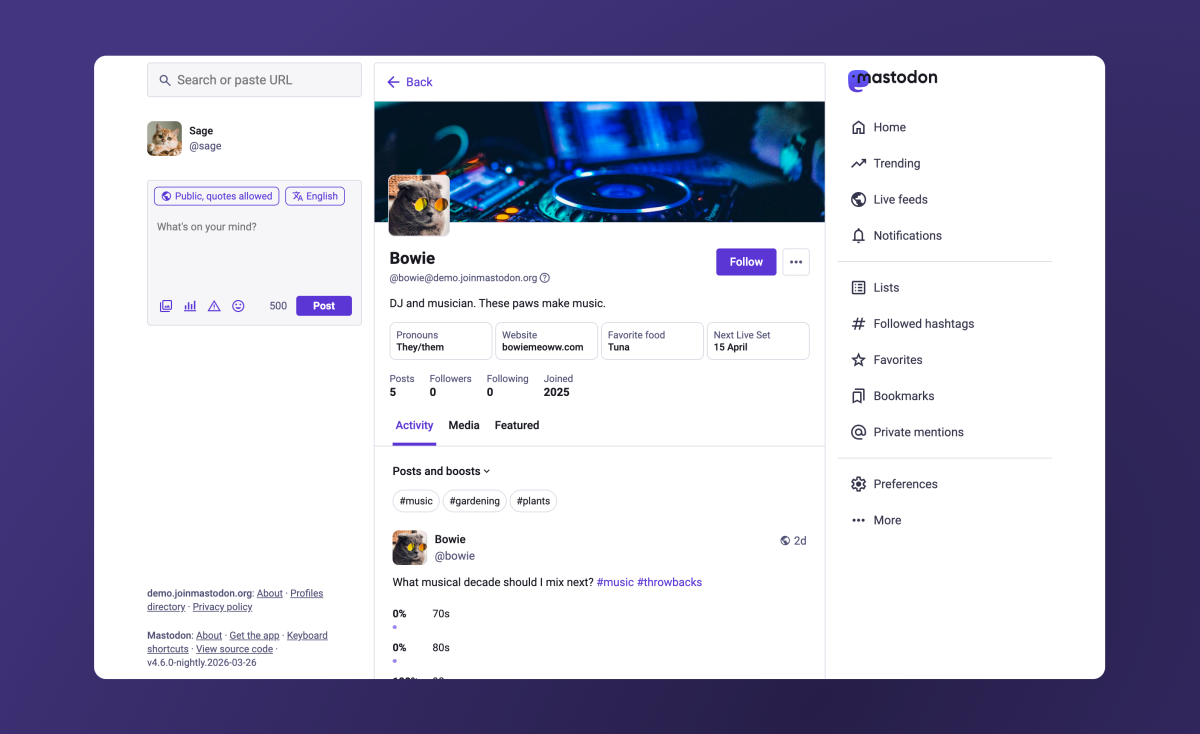
The biggest shift is how posts are viewed on a profile. Instead of having two separate tabs such as “posts” and “posts and replies,” profiles now feature a single “Activity” tab. A dropdown menu lets you decide what you want to see by toggling replies and boosts (Mastodon’s version of reposting). This approach aims to reduce clutter while still giving users control over what’s displayed.
Hashtags are getting more prominent placement, too. They now appear at the top of the Activity section, making it easier to filter someone’s posts by topic with a single click. For creators, community accounts, and organizations that post around themes or campaigns, this could make profiles feel more organized and easier to explore.
Mastodon is also changing how pinned posts work. The pinned posts carousel is being removed after many users reacted negatively to it. Instead, if someone has multiple pinned posts, one will be featured, and visitors can click a “View all pinned posts” option to see the rest. It’s a cleaner solution that keeps the focus on recent posts while still letting users highlight important content.
Another small but meaningful improvement addresses one of the most common points of confusion: the Mastodon handle format. Unlike platforms where a handle is simply @username, Mastodon accounts include the server name, resulting in a format with two “@” symbols. A new informational pop-up helps explain this to beginners so they better understand why Mastodon usernames look different and how to share or search for them correctly.
Users are also gaining more control over how their profile looks. People can choose to hide the Media tab or the Featured tab, and they can hide replies from the Media section if they want that area to function more like a portfolio or highlight reel of their work. This is especially useful for artists, photographers, journalists, and brands that want their profile to showcase media posts without interruptions from conversation threads.
Custom profile fields, commonly used for pronouns, links, and other details, are being displayed side by side. That change frees up vertical space and makes the profile look less stretched out. These fields can now be edited on iOS and Android as well, not only on the web, which makes maintaining a profile easier from any device.
Mastodon is also trimming visual noise with other subtle adjustments. For example, the “following you” badge is being removed, and the optional personal note is moving into an overflow menu to keep the main profile area cleaner. Profile editing is being streamlined as well: users will be able to manage profile elements from a single place in account settings, including featured hashtags (with helpful suggestions), links, and other key details.
Link verification, Mastodon’s method of establishing authenticity without relying on a centralized authority or pay-to-verify system, will be easier to find instead of being tucked away in settings. Users will also be able to crop and add alt text to profile images and cover photos, which is a meaningful accessibility improvement and a practical upgrade for anyone trying to make their profile look more professional.
These profile redesign changes will arrive first on mastodon.social and on other servers that choose to run the nightly build. A broader rollout is expected when Mastodon 4.6 launches in the coming weeks, bringing the refreshed profile experience to more of the network.
With these updates, Mastodon is clearly aiming to reduce friction, improve first impressions, and make the platform feel more approachable—without giving up the decentralized foundation that makes it stand out. For anyone considering a move away from traditional social networks, these profile improvements could make Mastodon easier to understand, nicer to browse, and more inviting to join.