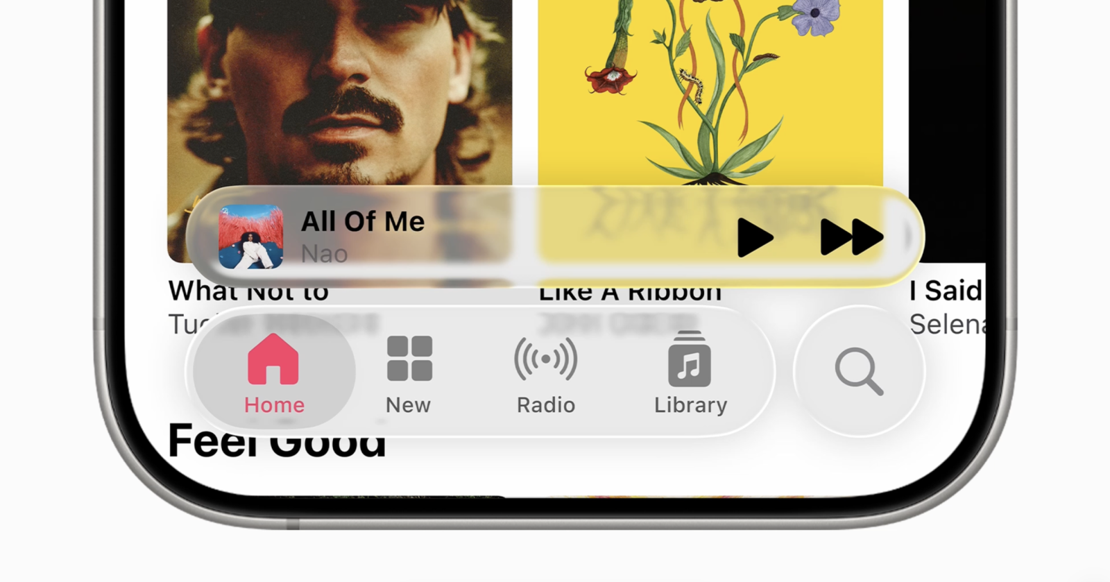
iOS 26’s Liquid Glass interface brings a sleek, frosted aesthetic to menus, notifications, and widgets—but that translucent look isn’t for everyone. If you find it harder to read or simply more distracting, you can tone it down. While there’s no master switch to turn Liquid Glass off entirely, a few quick tweaks will make your iPhone or iPad feel cleaner and more readable.
How to reduce the Liquid Glass effect in iOS 26
1. Open Settings on your device.
2. Tap Accessibility.
3. Choose Display & Text Size.
4. Turn on Reduce Transparency.
What this changes
– UI elements become more opaque, dialing down the frosted look.
– Text and icons stand out more clearly against backgrounds.
– Some areas—like Control Center, app folders, and certain widgets—will still show a bit of translucency, as the effect is part of the core iOS 26 design.
Extra tips to improve readability and minimize visual distraction
– Pick high-contrast wallpapers: Solid or darker backgrounds help text pop against any remaining translucency.
– Use bolder visuals: Choose solid or tinted icon styles and widgets to reduce the see‑through look.
– Consider Dark or Light Mode: Switch to the mode that gives you the best contrast for your eyes.
– Explore additional Accessibility options:
– Bold Text: Thickens system text for easier reading.
– Increase Contrast: Strengthens UI separation and visibility.
– Reduce Motion: Curtails parallax and other animations that can add visual noise.
These adjustments offer a practical middle ground—retaining the modern feel of Liquid Glass while making everyday navigation clearer and more comfortable. Have you tried these settings on iOS 26? Share what worked best for your setup.


