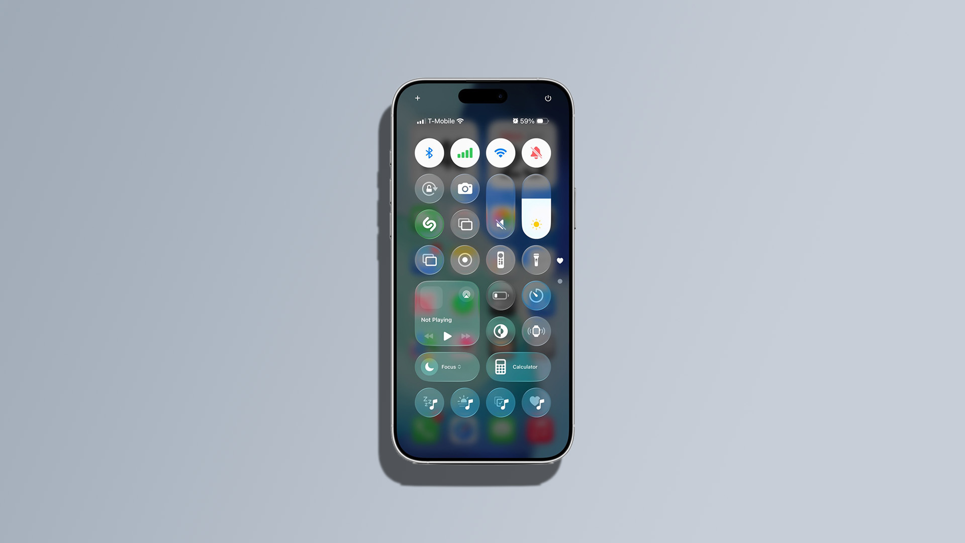
Apple’s Liquid Glass UI in the latest iOS 26 beta has sparked considerable debate. Known for its bold design changes, Apple insists this update offers a more expressive and responsive experience. However, initial feedback wasn’t entirely positive, particularly concerning the Control Center. In iOS 26 beta 1, app icons and widgets remained visible in the background, leading to a cluttered and distracting interface.
Recognizing the need for improvement, Apple has addressed these concerns in iOS 26 beta 2 by making the interface more opaque. This adjustment has significantly enhanced contrast and readability. Users have found that navigating the Control Center is now more intuitive and less overwhelming. The UI changes also include highlights that adjust based on the device’s orientation.
In addition to visual tweaks, iOS 26 beta 2 introduces a new ringtone option, providing an alternative to the previous Reflections tune. This adjustment adds a fresh layer of customization for users.
Interestingly, the latest beta has also hinted at future hardware releases. References to a new iPhone resolution of 2,736 x 1,260 pixels suggest the upcoming iPhone 17 Air might be on its way.
Stay tuned for more updates as Apple continues to refine iOS 26 leading up to its full release.